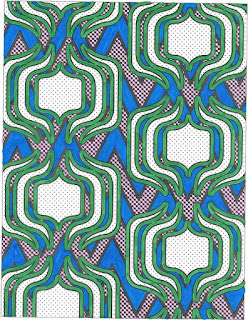
This next page threw me for a loop a little. I started with the background. I knew I wanted again two colours that matched and made the foreground stand out. After I started colouring the designs green I regretted it a little. I wish I would have coloured the white area green and the outline in gold or silver. This is why I left it white so I could colour it in a gold or silver colour.
This next page doesn't really look like anything to me. It made look like a decorative thing on a background but there's no real colours that jump out with this photo. Time to be creative!


No comments:
Post a Comment